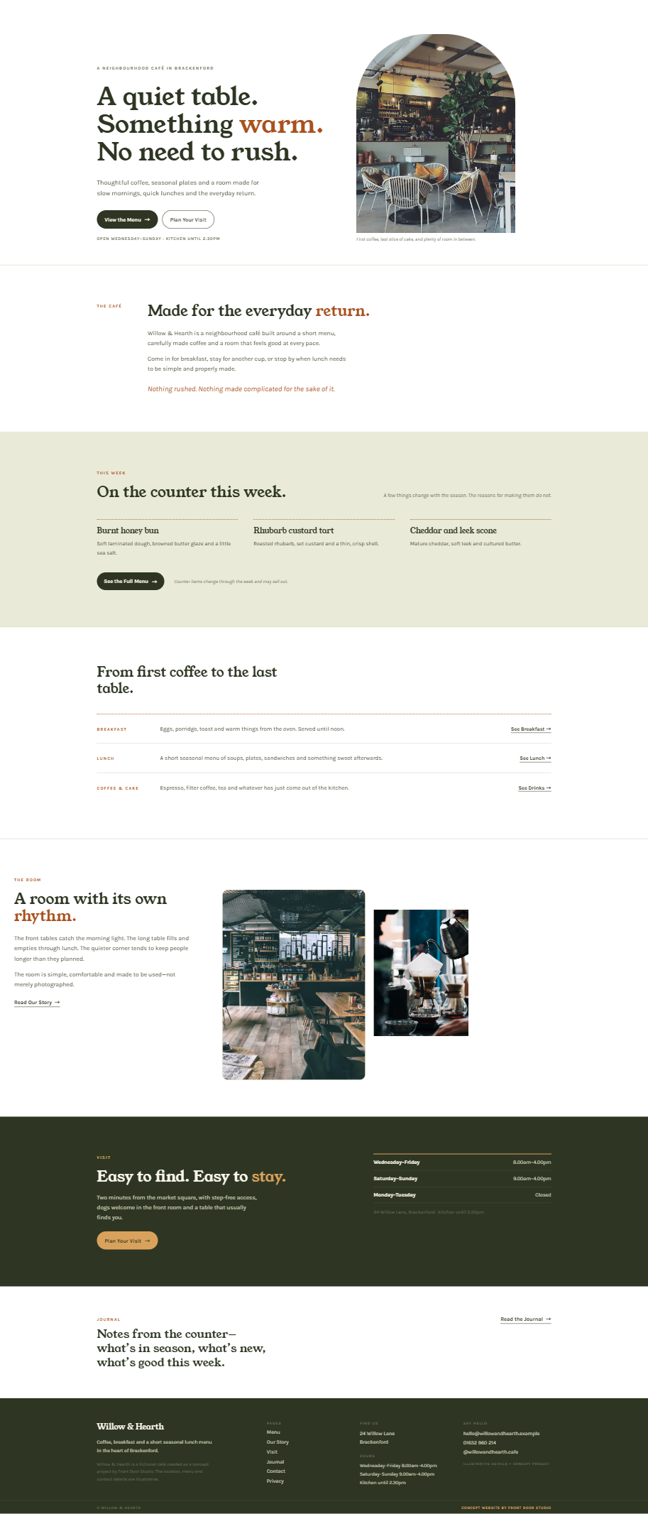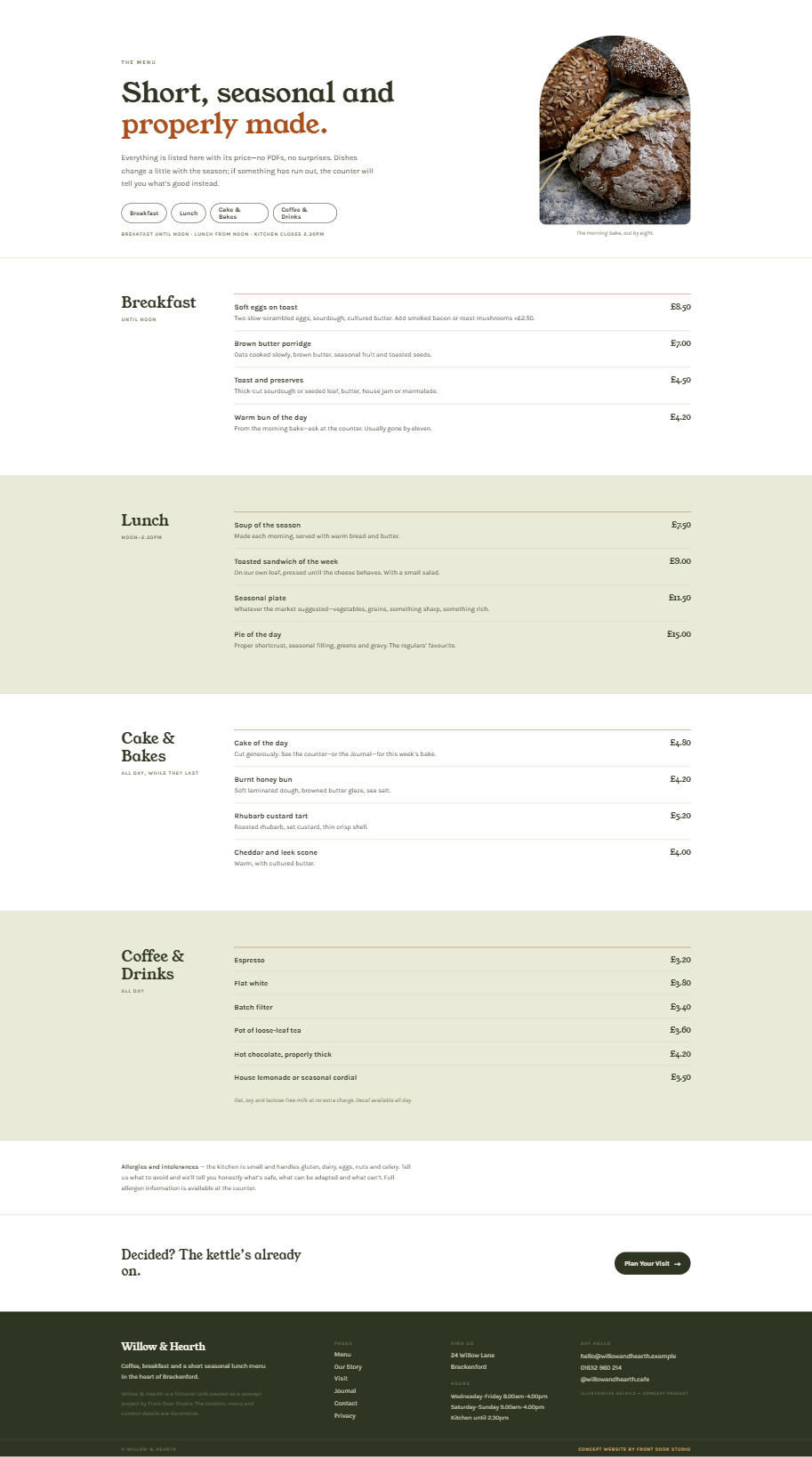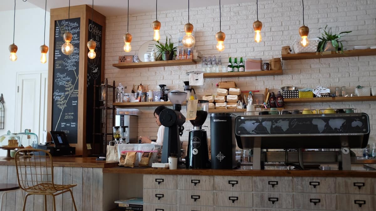
Concept photography direction: warm, tactile, unstaged—the room as customers actually find it.
A warm, editorial café concept that makes the menu, opening hours and visiting information easy to find—designed so a person walking past with a phone in hand can decide to come in.
The featured projects are self-initiated concepts created to demonstrate Front Door Studio’s design approach. They do not represent real client engagements, and no results or endorsements are implied.
People often decide on a café in seconds—usually on a phone and often while walking. This concept begins with a common problem: a menu buried in a PDF and opening hours scattered through a block of text.
The assumed brief: bring the menu, hours and directions to the surface—without losing the warmth that makes the room worth visiting.
Designed as accessible, scannable text with clear sections and prices—quick to read on a phone and simple to keep current.
“Open today 8–4” is intended to sit near the top of every page, rather than deep in a contact page.
Large, natural photographs of the room carry the character, so the interface stays quiet and legible.
Each page ends with hours, address and the menu link—the three things a deciding visitor needs.
Mobile is the primary case: hours and the menu within one thumb-reach of arrival, 48px touch targets throughout, and image crops recomposed for narrow screens rather than squeezed.
The full Willow & Hearth concept website is built and browsable: menu, visiting information, journal and contact, on desktop and mobile.
Does your website answer its visitors’ first questions?
ALL WORK